Prototyping at <HANDS: On> Cambridge University Hackathon
I was invited to participate as a developer at Cambridge University Library's week-long Hackathon, where ~30 postgraduates made educational app prototypes, giving researchers of the Hidden In Plain Sight project ideas for educational software.
INDEX
The week
The historical context
Imaging techniques & materials analysis
Prototyping
Teamwork & academia
Final thoughts
Recommended reading
The week
- Monday: Introductions, presentations & demonstrations on heritage-oriented scientific imaging techniques, design thinking for app development, meeting curators, etc.
- Tuesday: "Speed dating" for to form groups of 5, pitching project ideas, paper prototyping.
- Wednesday: Prototyping all day, an update at the end of the day.
- Thursday: Prototype app testing with brought-in testers who matched user personas, feedback meetings, more prototyping.
- Friday: Cleanup and presentation to university & project members.
The historical context
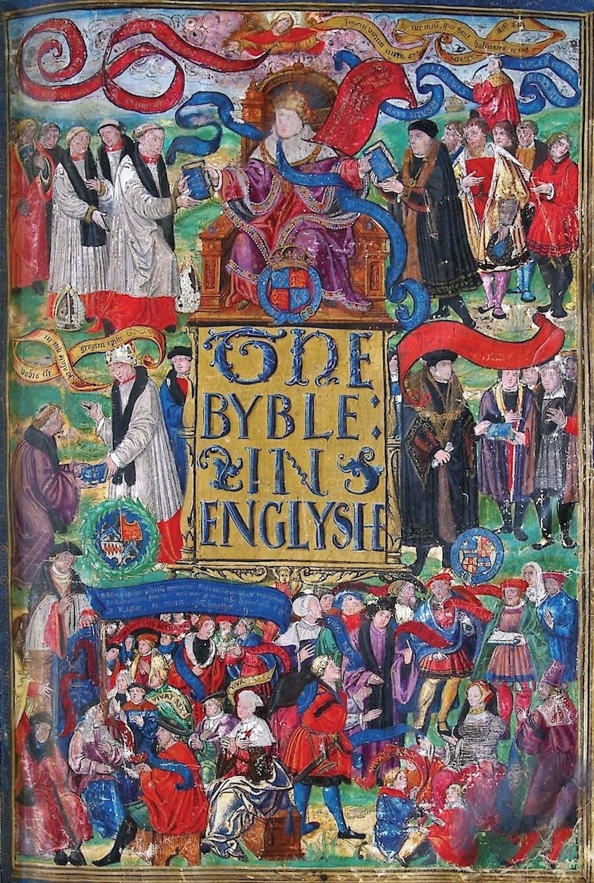
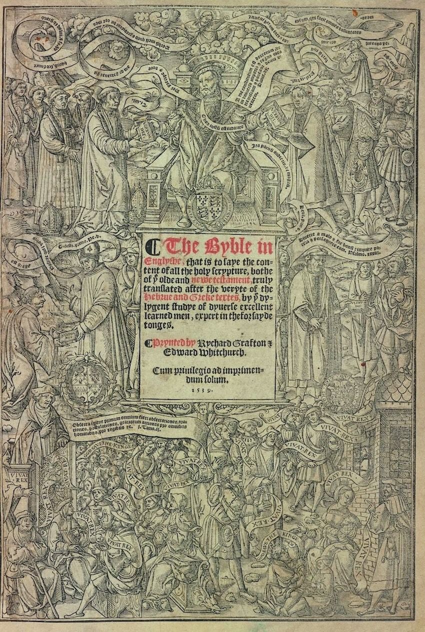
The Bible's first authorized English-language printing, The Great Bible (1539) was distributed to every English parish during the Reformation, for to legitimise Henry VIII's divorce from the Catholic church and self-imposition as the head of the local Church of England.
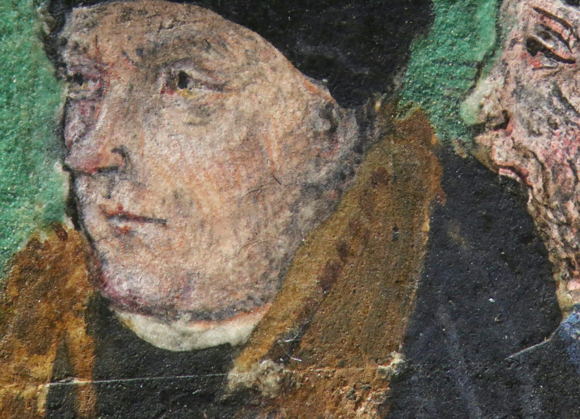
Thomas Cromwell (above) commissioned an illuminated variant for the king with his own portrait pasted over the figure to the king's right on the book's title page (below). That seam below his chin was discovered by illuminating the page with a raking light during microscope inspection.
Both versions are riddled with brazen heresy and propaganda, most comically the shunting of the word of the Lord to a narrow sliver above the enormous figure of the now-Godlike Henry VIII distributing these books to the populace below. You can read more about the illuminated copy's many political alterations here.
Imaging techniques and materials analysis
Having worked in the past in heritage digitzation, I was familiar with the purely photographic stuff like photogrammetry, MSI, panoramic stitching tools etc. The newer materials-specific techniques introduced to us in the labs around the Cultural Heritage Imaging Laboratory in the library included e.g. Fibre-Optic Reflectance Spectrography (FORS), and X-Ray Flouresence Spectroscopy (XRF - below).
Each technique has its own pitfalls: XRF isn't good with organics; some pigment identification processes are highly influenced by the pigment's substrate, and so on. Analysis of output data & graphs is consequently, in the researchers' own words, highly interpretive.

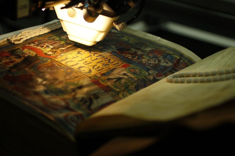
Macro-XRF Analysis of the Great Bible by Nathan Daly at the Hamilton Kerr Institute
Application of machine learning to these technologies has been discussed (1, 2), and surveys have identified that there is more general uptake of ML in a cultural heritage context (2020, 2022), but even in larger institutions this can be either highly localised to a specific project, be owing to financial or quality requirements slow to develop, or be otherwise tailored insufficiently.
The prototypes we made at the hackathon focused on public edification rather than on e.g. internal tools for researchers; I'd love to be involved in designing and building massive data & training sets for specialised open source tooling.
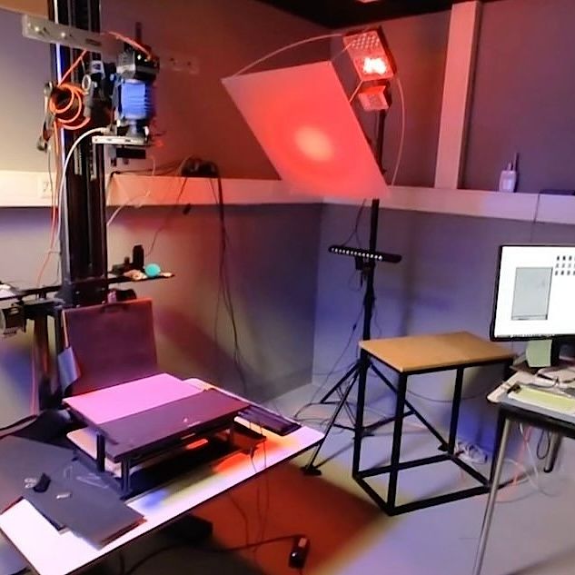
The MSI unit in the CUL Digital Lab.
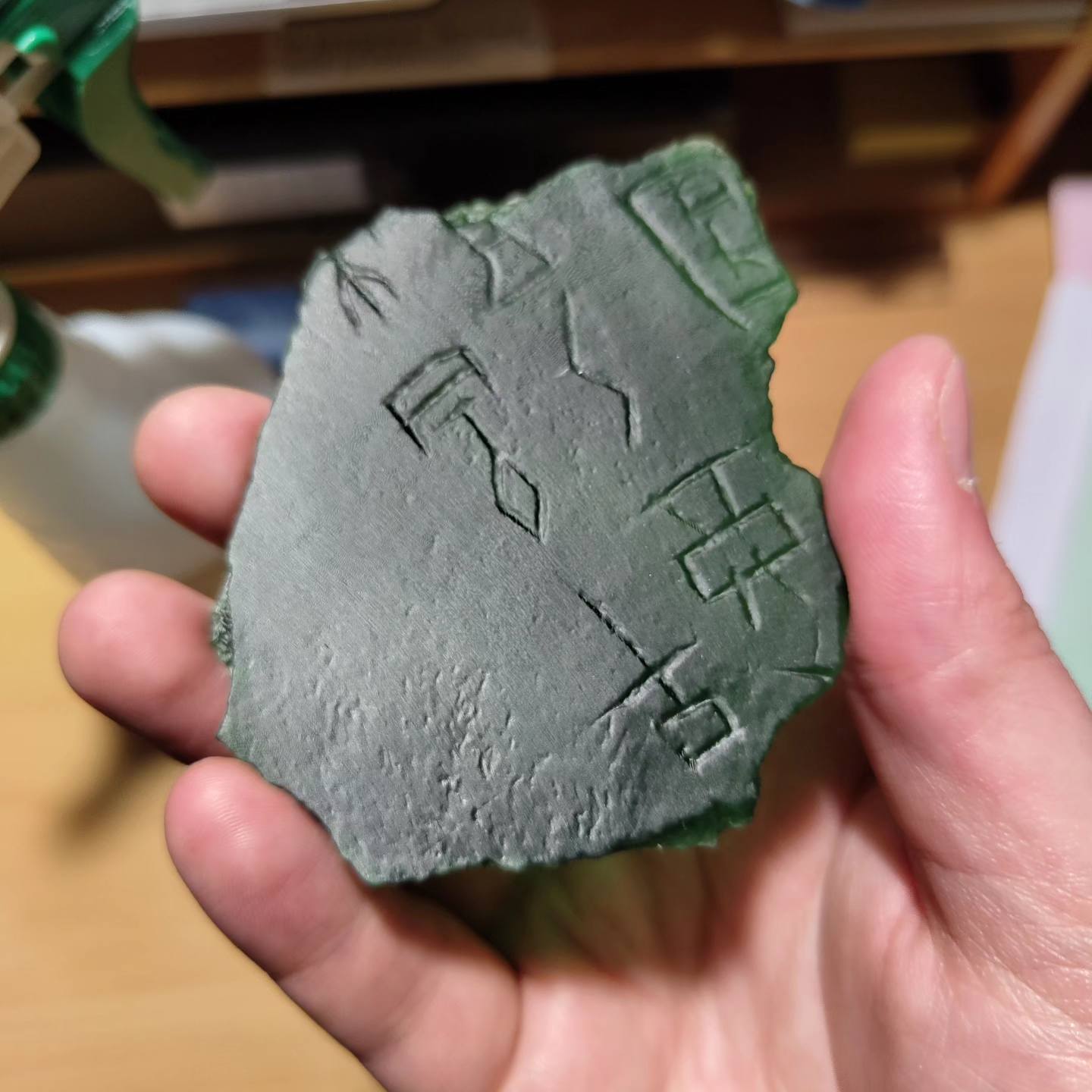
A 3D print of a Chinese oracle bone, digitised via photogrammetry
Prototyping
The goal was to make an educational app providing extra insight into this book and/or the analysis methods used to study it.
With four software developers and around 25 students, four groups were formed. In past years app prototyping was done with a generic JS stack; the last two, the hosts moved to simulating a user experience by building UIs with basic conditional logic in Figma, owing to developers having to stay up late in previous years programming in the features, and due to their role in the collaborative process being both less integrated and less accessible to non-technical participants.
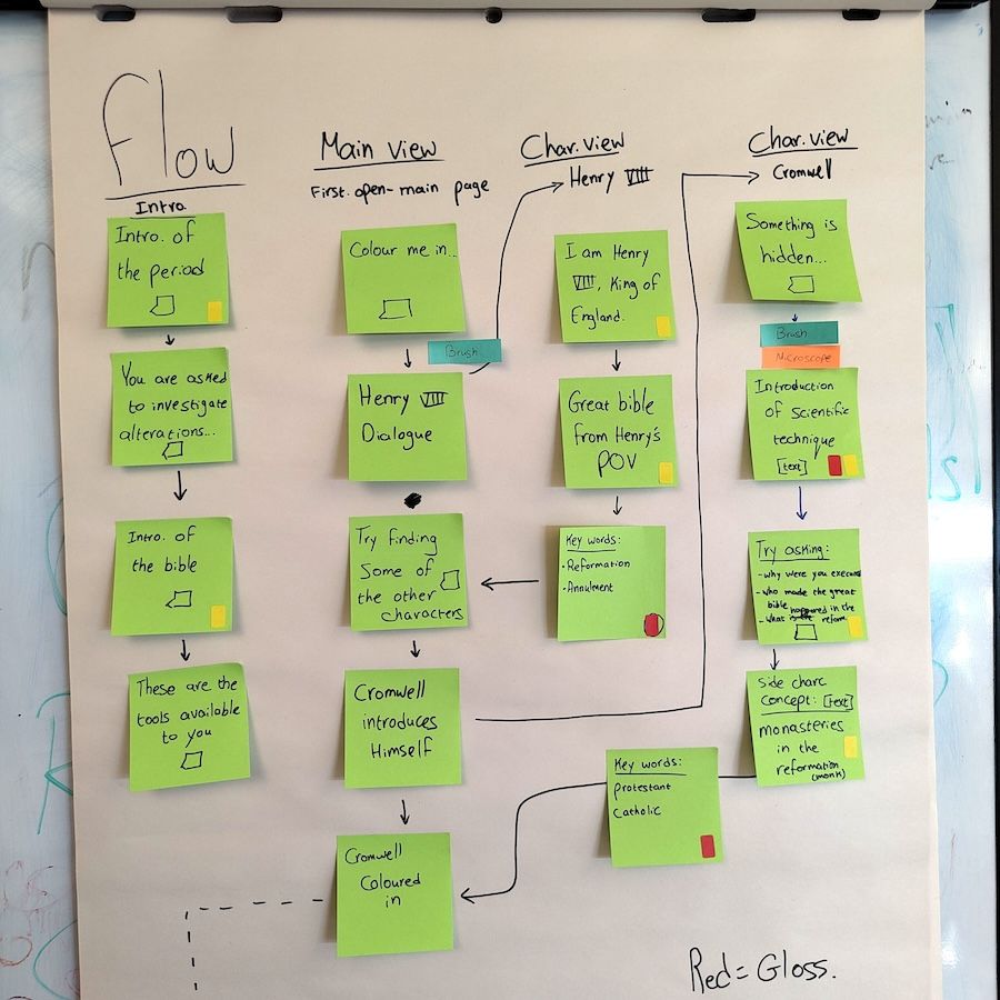
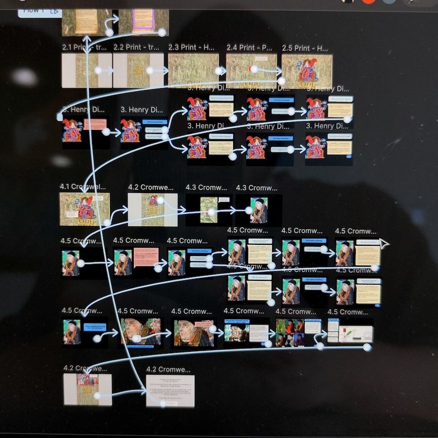
Workflows from board to screen
By doing this however the scope of the app prototypes expanded and so this year also we developers stayed up late. This really was OK, but is humorously microcosmic of automation in industry.
With stylised history-themed mystery-puzzle games like Return of the Obrah Dinn and Pentiment in mind, teammates envisaged a "find the clue" investigation game in which the player - cosplaying as a researcher-out-of-time tasked by the King to find out why his special copy of the Bible is so suspicious - would inspect and 'colour in' the print version with the illuminated colour version by applying these research tools to it, in a click+paint manner. For the final product itself, TTS and adaptive animation tools like Facebook's Animated Drawings might be utilised.
Achieving this with Figma being difficult, we opted for a simpler click here to see how it'd look button to trigger a fading painting-in-effect animation.
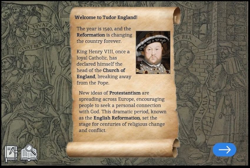
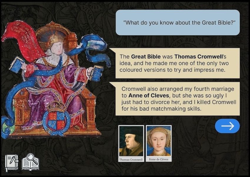
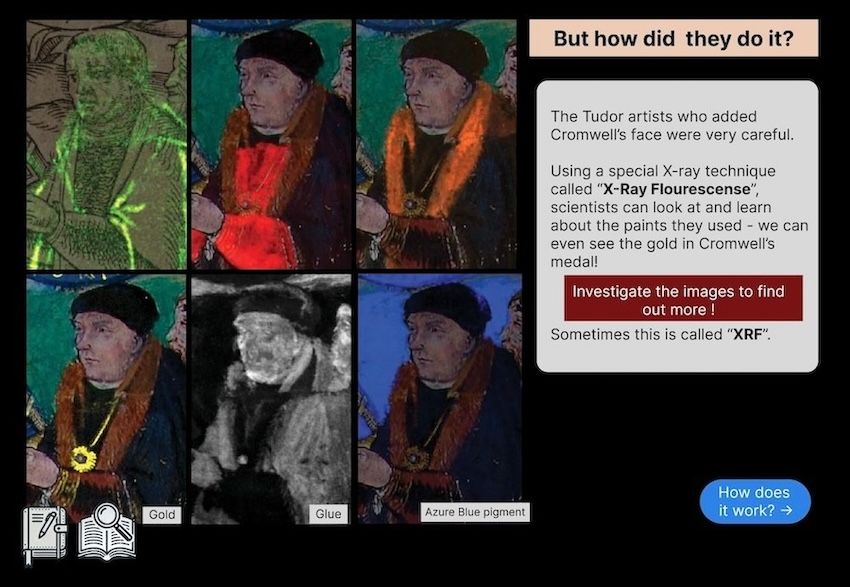
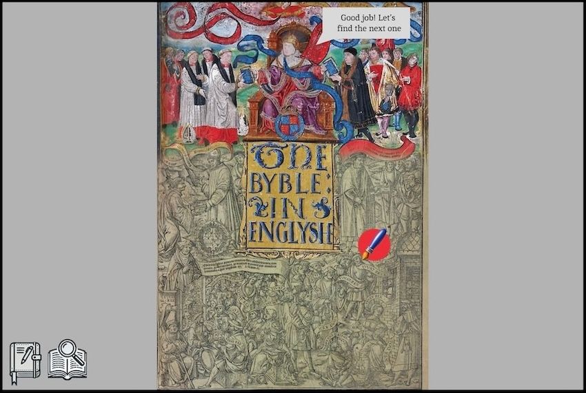
Screenshots from our Figma project.
Without a proper toolchain prototyping for a minigame like this involves "telling" over "showing" for the testers brought in; we imagined a GUI showing many different tools to use on the manuscript; we were advised to instead simulate the experience of one or two features, well. As such we hard-coded a fixed path, rather than the "open map" we wanted, where the user would zoom in & out and inspect the pertinent elements of the title page in whatever order they desired.
Whereas many project ideas take time to develop naturally, the basic shape of our project was already partly formed at the group-forming stage. Interested in a younger persona (a schoolkid) seeking an entertaining but edifying resource for a school report, our team began walking through how a user would experience the first stages of the game. We were quickly advised to slow down and take a step back; we tried, but despite reaching a roadblock on the 2nd day, we all shared roughly the same vision for the project.
Teamwork and academia
Though using Figma with only a little practice was a challenge, the most difficult thing was properly interacting with my fellow groupmates - as a developer I was also charged with helping to 'manage' the team a little, advising on ideas and keeping things on track so as to prevent scope creep. But really, I just wanted to follow every tangent. Also difficult was appropriately involving myself creatively; I was supposed to do so, but not too much, and I was at the start slightly too focused on this and not enough on those parts of my role.
Done! The prototype is ready for tomorrow's presentation and you can be the first to see it. A big thank you to the team, it was amazing working with you on this prototype!
— Martin Rocek (@Silencesys) June 20, 2024
Can you think of website like this for your research? pic.twitter.com/uMbTBYntU4
One of the developers, Martin Rocek, was experienced with Figma and previous Hackathons both, and kindly offered technical support to we other developers. His group's contribution was the most polished, and was for its more conservative design and refined architecture, likely the ideal reference choice for the Hidden In Plain Sight project. Martin has made a lot of interesting digital humanities things - have a look here.
Other groups were more experimental in their presentation. Inspired by floral marginalia, R's group's UI was busy and digital-scrapbookish, with a stack-like architecture wherein the user would look closer, learning progressively finer detail of the book before gradually zooming back out.
J's group designed a linear progression of 3-column page layouts in which each main layout page had sub-pages or elements (like nodes) which could be interacted with before progressing onto the next main page. On each page the centre column contained article text, with comparison images either side. This more explorative and preference-driven user experience over a fixed path is suitable for museum tablets and displays.
Outside of work, all we different groups met for breakfasts and dinners. All parties involved enjoyed a lovely meal on a green outside the host's residence on the Wednesday eve.
Most of the time, being around other humans and being on my own feel to me very similar. People who bring the particular quality of having substantial knowledge interests, unabashed idiosyncracies, comfort prodding convential ideas and enthusiasm for new ones, are in the real world rare. All of these academics' areas of research were fascinating and the energy they carried in discussing them and sharing ideas with one another was a rare pleasure.
Younger, less jaded researchers' casual discourse, free of the oily pretention of too many career academics and of the simplistic platitudes and moralities of daily life's conversants, allows for description-oriented discussion about and calm evaluation of usually sensitive political and cultural topics, without the typical encumbering verbal asterisks, and it is missed.
Here's a video walkthrough going over most of what we did:
Final thoughts
This prototype was a youth-oriented homework aid. For myself, I would rather than a game prefer to make a comprehensive visual comparison tool designed to use these two front pages as a single point of reference through which the entirety of the Reformation could be filtered to an engaged, even specialist audience - a sort of historiographical fulcrum.
I feel somewhat conflicted about our contribution - the game idea was good and I would really like for my teammates to see it realised, however the final Hidden In Plain Sight app will be developed by a single member of the project team who has some webdev experience working in a developer-adjacent role. Given time/budget constraints typical to heritage sector projects, I don't expect building a game is feasible compared with less architecturally complex and asset-light prototypes. I could be and hope I am wrong.
I encourage those reading this, be they developers or academics, to consider participating in this or like events.
Recommended reading
- The Fitzwilliam Museum Illuminated Manuscripts Lab
- How Thomas Cromwell used cut and paste to insert himself into Henry VIII’s Great Bible - Ian McKee.
- A Material History of the Bible, England 1200 –1553, Eyal Poleg
- Science of the Book::Analytical Methods for the Study of Illuminated Manuscripts - Paola Ricciardi and Catherine Schmidt Patterson
- Martin Rocek's digital humanities tools
- Here's a short video of a previous iteration of this Hackathon.
- A prototype tool from a previous Hackathon for learning how to inspect medieval manuscripts.